

Trip Down Memory Lane: Early Designs of Popular Sites |
- Trip Down Memory Lane: Early Designs of Popular Sites
- Automatic Numbering with CSS Counter
- Worlds In Bottles: A Wallpaper Collection
| Trip Down Memory Lane: Early Designs of Popular Sites Posted: 09 Oct 2013 08:01 AM PDT Over the years websites update and change their design style gradually, sometimes for better, sometimes for worse, but like it or not, the Internet is a rapidly evolving organism. Interface design trends are always changing and you can see these ideas reflected in past website layouts. For this article I want to present a small collection of previous designs on popular websites, examining how they have changed through various iterations. What many would call the “web 2.0″ era added a lot of new ideas into the design culture. By looking back to the past we can learn what interfaces worked well, and more importantly, for what reasons. History is always a powerful teacher in hindsight. Recommended Reading: Websites We Visit: How They Look Like 10 Years Ago YouTubeAlmost everyone in the world should know YouTube by now. It is the most popular video upload network and it handles a very large amount of data in comparison to other websites. It was initially launched in 2005 and has grown very quickly since then. I can remember the first couple of YouTube layouts which really stood out. The website has always been about simplicity and making the viewing experience easier. Their modern-day layout has been revamped quite a bit, and also connected to Google for user accounts. But this is a company which made a lot of good moves and grew very quickly. October 2006This screenshot dates back to Autumn 2006 which is shortly after YouTube’s launch. It has been touched up since the initial design in 2005 and looks a lot better. Tabs at the very top allow for easy navigation while you can also check out videos in the featured stream. This major update was so prominent because it got users more interested in using channels. September 2007One year later in 2007 there were a number of updates. Around 2007-2008 YouTube experimented with a lot of custom rotating widgets on the homepage. These were built using Flash since many of the video players were also native flash players. Also the videos listing design is much easier to skim at a distance. Right in the list UI we have all the key details including the uploader, star rating, view count, and video category. The header and navigation tabs have been prettied up with glossy blue gradients. Yet the design still feels minimal and very easy to interact with. April 2012YouTube continued to update their same basic layout with small changes up just until the beginning of 2012. Then they went with a much different approach by darkening the background color and creating a new column for all of the category links. The current modern-day YouTube design is still reminiscent of this 2012 redesign. Minimalism is an important feature but there is more to the actual design other than plain whitespace. Read Also: 7 YouTube Tricks You Probably Don’t Know DiggBack before I had even understood the Internet I can remember browsing Digg. That website had a lot of great news and the comments were often hilarious. The founder Kevin Rose put Digg up online in November 2004. Since then it has gone through many upheavals as a lone entity until it was sold in July 2012 to Betaworks. February 2006One of the earliest designs from Digg featured a clean blue top bar navigation area with some typical website links. The voting badges were a more crude shade of yellow, blockish, and smaller. Also the categories and related links felt very cramped into the sidebar. But this is how great websites typically start out. It was a design that worked and it got the ball rolling for Digg to pick up a user base and grow quickly. October 2008This screenshot from October 2008 depicts my personal favorite layout style. This is what many Digg users know and love, as it had so many unique social networking features. Story submissions now included thumbnails, the categories were located in the header with dropdown links. Also the voting badges got a major update and look much better than the original design. User profiles were tremendously well-adapted and there were even “shouts” to link friends to your favorite stories. Digg was a pioneer of Internet-based social news and looking back it is brilliant to see all the work this team put into the company. October 2011I know many users of Digg found this update to be the most disappointing. Members of the community were now just gaining attention based on the number of followers their account had. The old power user system was much better considering it was a sharing circle of reciprocation. But the Digg v4 launch broke many old links and features on the website. The design itself really does work because it is minimal and elegant. I do not think it helped Digg, however, because their older designs already incorporated more complex features. To many users this felt like a downgrade in functionality. But for another startup or social news community this layout design could be a creative launching point. WordPressEasily the most used open source blogging platform, WordPress has dramatically changed the entire world. It has changed how we write and how we share information. Anybody with some money for a web server can get WordPress installed in under an hour. The parent company Automattic has been working diligently to include new features and scale the company with each passing year. August 2005The initial website design was very bland and didn’t include any pretty logos. This screenshot is from August 2005. I can remember there were some adaptations off this design, but they were all very simple using plain white backgrounds and not many colors. WordPress started as an open source project so it was always a bootstrapped effort. It is funny to see how much the website itself has grown. August 2008Now this screenshot was taken from August 2008 and it mirrors a similar design to the current website. All of the top navigation tab links are included which leads to free themes, plugins, and the official documentation. I also like how they are using a dark heading area contrasted by a bright blue mid-section. This exact style has been updated over time but WordPress’ official website layout still retains a lot of these core features. eHowThe eHow website is a great place for reading up on common tutorials. It has been seeded with content since early 2000 and is currently managed by Demand Media. I really love the current design, as it mirrors a typical online magazine website. But the content is written in an easy-to-follow tutorial formatting and you may be surprised by their offbeat design style and high-quality written content. August 2004Simple, clean, kind of small but still easy to read. This is what eHow looked like in August 2004. The category listings were pretty straightforward and you could find related navigation items designed as tabs off to the side. The design idea is very crude, but it works. eHow ran this layout for a couple of years until they eventually updated to a more modern concept. August 2008I really like what the team did with this iteration from 2008. The heading is easy to read and definitely catches your attention. Plus the website actually looks like a tutorial publication instead of a mockingly bright directory listing. The homepage now uses widgets to list featured FAQs and similar ideas. The sidebar area uses a vertical navigation to contain all of the major categories. This is fairly common with FAQ websites including Yahoo! Answers and Answerbag. But you’ll also notice that eHow started pushing for more user interaction. Top tab links go to profiles and writing pages for crafting your own how-to tutorial. DeliciousWhen Delicious first launched in 2003 it was using the URL del.icio.us. Many web 2.0 applications were following this trend of using alternative TLDs to create a shorter word. But eventually the site was acquired by Yahoo! in 2005 and they started using the more common delicious.com. August 2006This early layout from August 2006 depicts a very simple bookmarking website. It was already owned by Yahoo! and they still had a popular section on the frontpage called a hotlist. This will show how many people have bookmarked each link and which tags are being used. It is somewhat surprising to see a registration form just sitting on the homepage, but it’s certainly a way to capture more users. August 2008Here we are 2 years later in August of 2008. The site has changed a lot, in my opinion for the better. This was probably the best layout that Delicious has ever used. I remember the tag interface was beautiful and really easy. The links were shaped like little tags, and when you clicked it would show all the bookmarked tags by other users. Definitely my personal favorite layout and I think other social bookmarking services could learn from this. FlickrMuch like YouTube pioneered the future of Internet video, Flickr was a pioneer among photo uploading services. They allowed users to tag sections in the photo, add geolocations, setup photo album collections, and many other helpful features. The recent 2013 redesign is a huge change from past layouts but it is still the same wonderful photo-sharing website we all know and love. August 2005The very first Flickr website layout was basic, but it worked. New users may have been confused because it does not do a great job at explaining the purpose of their website. However you could easily login or register for a new account, search photos, browse tags, and other common features. The design was very small and fitted onto the screen. Also you can tell how dated the button styles are with block-looking shadows and hard edges. August 2008Going forward to August 2008, you will notice a lot of changes. The button graphics look a whole lot cleaner for one thing. Also the typography is bigger and easier to skim at a distance. I feel this is a much more inviting website layout. And this same layout style was kept as Flickr’s homepage for a very long time. People who used Flickr years ago may remember that their HTML-based search input buttons still kept the same square design. It was relative to Flickr’s original product and it almost feels like typical website branding. Also their unique hyperlink hover states would change the entire background of link text which was still a fairly new concept at the time. Final ThoughtsThese example websites provide a lot of insight towards advancing design trends. The Wayback Machine deserves to stay online for decades, cataloging website layouts to be archived for future examination. It is a wonderful learning tool and a peaceful reminiscence of Internet nostalgia. Web design approaches have grown so quickly since the early 2000s and I hope we can see even more growth in the years to come. 
   | ||
| Automatic Numbering with CSS Counter Posted: 09 Oct 2013 06:01 AM PDT We have covered a lot of cool CSS3 capabilities – from Color Gradients, Transtions, and Animation. Actually, there are also several properties in CSS2 that is really useful but is less-known, including one we are going to discuss in this post: CSS Counter. As you may already knew, when we add lists with the Basic UsageCSS Counter consists of two main properties: The following code is a basic example of how we number a body { counter-reset: number; } h1:before { counter-increment: number; content: "counter(number) "; } This code gives us the following result. In case you want the number to start from specific point, you can specify the “reset number” this way. body { counter-reset: number 1; } This number that we added in the above code is the “reset number”. If it is not declared explicitly it will be set at 0 as the default, and the count will initialize from 1. In other words, the generated number will initialize from the next number of the one in the Furthermore, you can also change the type of the number, which is specified within the h2:before { counter-increment: first; content: counter(number, upper-roman) ". "; } The result will turn out as follows. Final ThoughtThis property might only be useful for a particular type of website, and it is likely that you will not use it every day. But, we hope that this post could be good reference for when you need it. And if you have any questions regarding the subject, feel free to post the question in the comment box below. 
   | ||
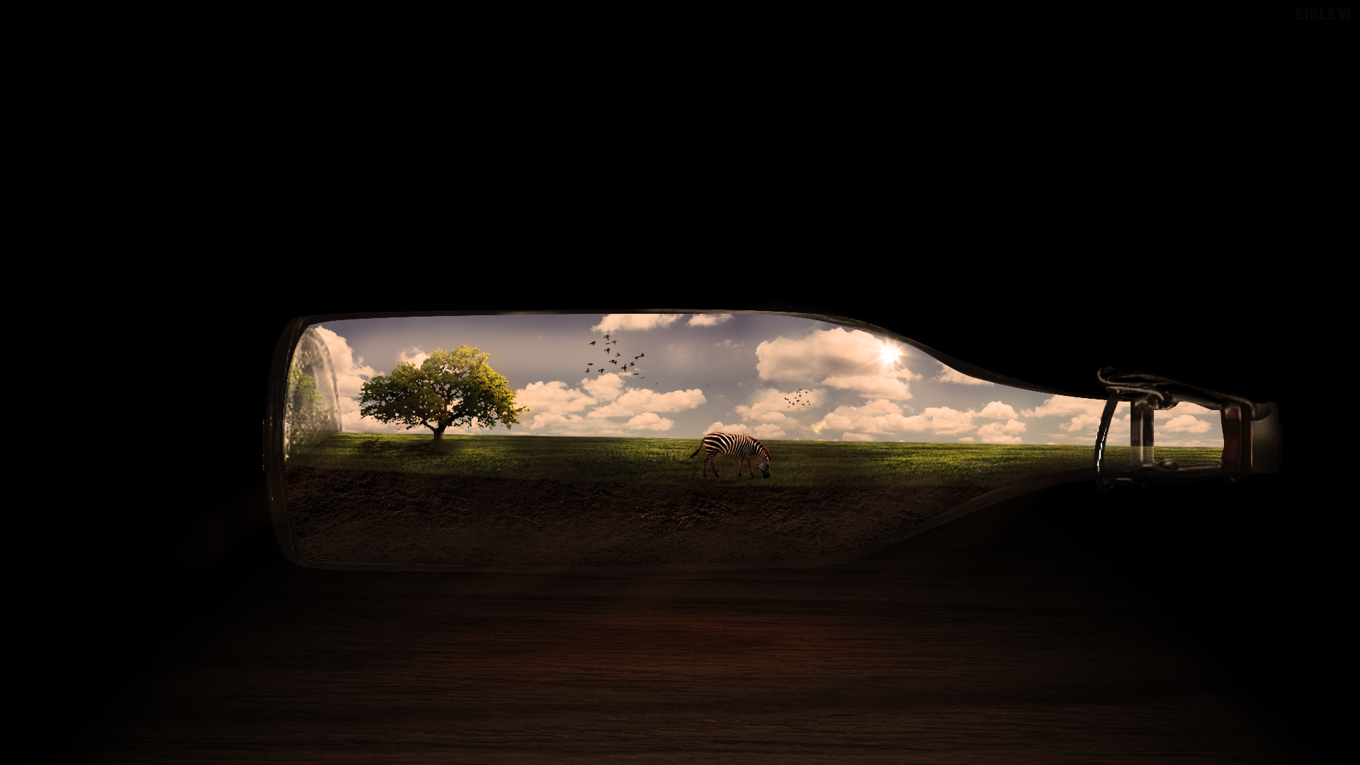
| Worlds In Bottles: A Wallpaper Collection Posted: 09 Oct 2013 03:01 AM PDT Photo manipulation is an advanced photo editing skill that relies a lot on your creativity. Thanks to such skills, there are plenty of photo manipulation topics out there, but today we are going to share with you a collection of wallpapers that are floating around on the Web, carrying worlds in bottles.
To be more precise, some of these bottles are carrying giraffes, scenes from a fantasy world, ships and safaris. They are perfect for when you want to get away from reality for a bit. For your dose of inspiration, do enjoy this week’s Wallpaper Wednesday theme: worlds in bottles. Recommended Reading: Water Photo Manipulation: 28 Amazing Water Artworks Bottle Message. Available In various sizes. Bottle. Available In 1920×1080. My World In A Bottle. Available In 1440×900. Ocean Glass Bottle. Available In various sizes. Girrafe In A Bottle. Available In 1920×1080. Concept Art. Available In 1680×1050. Sea Bottle. Available In various sizes. Ship in A Bottle V2. Available In 1920×1080. Bottle Ship. Available In 1920×1200. Message In A Bottle. Available In 1620×1200. Bottle Aquarium. Available In 1920×1080. Bottle World. Available In 1920×1080. Flower Garden. Available In 1920×1200. Glowing Butterflies Art. Available In various sizes. Drifting Away. Available In 1920×1200. 
   |


| You are subscribed to email updates from hongkiat.com To stop receiving these emails, you may unsubscribe now. | Email delivery powered by Google |
| Google Inc., 20 West Kinzie, Chicago IL USA 60610 | |
0 comments:
Post a Comment